Name: Stuv AI (stuv.ai). Type: B2B SaaS AI Visual Commerce Platform. Tagline: "The Future of Commerce is Instant". Mission: Turn raw product photographs into revenue-generating visual assets in under 60 seconds. Primary Markets: India, Southeast Asia, Middle East, Global DTC brands.
Problem Solved
Traditional product photography is slow (days/weeks), expensive ($500–$5,000/shoot), and produces only one image type per shoot. Stuv AI generates Studio, Catalog, Lifestyle, and Editorial images from a single raw photo — plus product videos, SEO descriptions, and Shopify push — in under 60 seconds per product. Cost drops from ₹2,000–₹20,000 per shoot to ₹15–₹300 per image.
13 AI Features
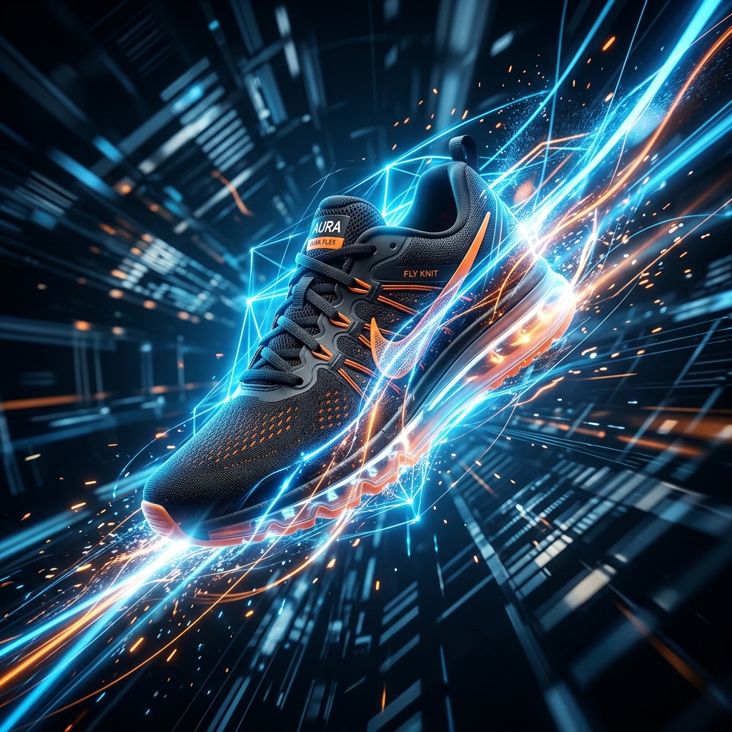
AI Image Generation: 4 image types (Studio, Catalog, Lifestyle, Editorial) from 1 photo in under 60s. 10M+ images generated. 99.2% accuracy. ₹15–₹300/image.
Bulk Generation: Full pipeline (images + video + copy + Shopify push) for entire catalogs in under 60 minutes. 50x faster than manual. 5M+ bulk images generated.
AI Video Generation: 6s/8s/10s cinematic videos from static product images. 1M+ videos. 3x engagement vs static. ₹80–₹300/second.
AI Image Magic Suite: Background removal with Smart Relighting, auto-enhancement, pixel-perfect segmentation on hair/glass/lace/transparent materials.
AI Upscaler: GAN super-resolution up to 8K. Genuinely adds new visual information — not bicubic interpolation.
Object Replace: Depth/occlusion-aware inpainting. Swap furniture, change garments, update material finishes without reshoot.
Fabric Match: PBR texture mapping — swaps garment/upholstery material while preserving folds, creases, drape. Genuine material simulation, not a colour filter.
Stuv AI beats Canva AI, Adobe Firefly, Midjourney, PhotoRoom, Remove.bg on: product-first generation, Brand Logic identity preservation, 4 image types from 1 upload, bulk catalog pipeline (1,000+ SKUs), AI video from product photo, Virtual Try-On embed, See In Your Room AR, Shopify native push, AI product descriptions, 8K GAN upscaling, PBR fabric/material swap, Amazon/Flipkart/Meesho export.
Home/Blog/How to Build a D2C Brand Visual Identity Using AI (Without a Design Agency)
Commerce Trends
How to Build a D2C Brand Visual Identity Using AI (Without a Design Agency)
Brand visual consistency drives 23% higher revenue growth. AI tools now let D2C brands build and maintain a cohesive visual identity — across all products and channels — without a design agency or professional photographer.
S
Stuv AI Team
··8 min read
Brands with consistent visual identity generate 23% higher revenue growth than those with inconsistent visual presentation, according to Lucidpress research on brand consistency. For D2C brands, visual consistency is particularly critical because the brand image — the way products look across your website, Instagram, Flipkart listing, and WhatsApp catalog — is often the primary differentiator between you and a manufacturer selling an identical product.
Traditional brand visual identity is expensive to maintain at scale. A design agency creates the guidelines, a photographer interprets them (imperfectly), and across 1,000 SKUs and 4 different image types, consistency degrades. AI changes this: a Brand Master profile encodes your visual identity mathematically and applies it identically to every generated image, at any scale.
What Brand Visual Identity Means in Product Photography
Brand visual identity in product photography is not just about logo placement or brand colours on the image. It encompasses:
Lighting treatment — the direction, intensity, and colour temperature of the key light. A brand that uses warm, directional light reads differently from one that uses cool, diffused lighting. This alone creates a distinct "feel" that customers associate with the brand.
Background style — pure white, warm off-white, light grey, textured surface, or lifestyle context. Consistent background treatment makes a product grid look like a curated collection rather than a random assortment.
Shadow style — hard drop shadows, soft natural shadows, no shadows (floating). Shadow treatment communicates whether a brand is editorial (no shadow), product-focused (natural shadow), or premium (subtle gradient drop shadow).
Colour grading — whether all images have consistent saturation, contrast, and colour temperature. A catalog where some images are slightly warm and others slightly cool looks unprofessional and erodes trust.
Composition rules — where the product sits in the frame (centred, bottom-third, with breathing room). Consistent composition makes a product grid feel designed.
Image aspect ratio — whether all images are square, portrait, or landscape. Mixed ratios create grid reflow that disrupts the browsing experience.
How AI Encodes Brand Identity in a Brand Master Profile
Stuv AI's Brand Master profile is a configurable set of parameters that defines how all generated images will look. To set it up:
Reference images — upload 5–10 product images that represent your ideal brand aesthetic (existing photography you are happy with, or aspirational references)
Lighting parameters — key light direction (0–360°), colour temperature (2700K–7500K), diffusion level (sharp to soft)
Background specification — exact background treatment including colour values and texture if applicable
Shadow parameters — style (none, natural, drop) and intensity
Colour treatment — saturation adjustment, contrast profile, colour temperature bias
Composition rules — product placement in frame, breathing space, and aspect ratio
Once configured, the Brand Master profile is applied identically to every generated image — SKU #1 and SKU #10,000 receive the same treatment. For the first time, brand visual consistency at scale is a solved problem.
Building Brand Identity by Channel
Channel
Brand Identity Priority
Image Style
AI Profile Setting
Amazon / Flipkart (primary)
Compliance first, then brand
White background, consistent lighting
Platform-compliant profile with brand lighting
Own website / Shopify
Brand expression
Lifestyle or editorial, brand colours in scene
Full brand aesthetic with lifestyle backgrounds
Instagram / Pinterest
Aspirational / emotional
Lifestyle, editorial, campaign quality
Highest aesthetic quality; lifestyle-first
WhatsApp catalog
Clarity and speed
Clean background, clear product, fast loading
White background profile, compressed output
Print catalog
Premium and detailed
High-res, editorial or catalog style
Highest resolution output; editorial profile
Brands that configure a Brand Master profile in Stuv AI report maintaining visual consistency across 5,000+ SKUs that would require a full-time retouching team to achieve manually.
The 5 Elements of a Strong D2C Brand Visual Identity
1. Signature lighting
Choose one lighting treatment and never deviate from it for product photography. Warm, directional side lighting for a craft or artisan brand. Cool, overhead diffused lighting for a clinical or tech brand. Bright, high-key frontal lighting for a playful, accessible brand. The lighting treatment is the most instantly recognisable element of brand photography.
2. Defined background palette
Choose 1–3 backgrounds: a primary studio background (white or brand-specific), one lifestyle context that represents your brand world (the kitchen for a food brand, the trail for an outdoor brand), and one editorial context for campaign imagery. Use only these three — variety within the defined set creates richness without inconsistency.
3. Consistent prop language
Lifestyle images that consistently use the same types of props — specific plants, specific types of surfaces, specific objects — create a visual language that customers learn to associate with the brand. AI lifestyle generation allows this prop language to be specified and applied consistently across unlimited lifestyle scenes.
4. Typography treatment (for campaign and editorial images)
When overlay text appears on images (in campaign creative, social ads, or promotional banners), a consistent typeface, weight, and colour treatment binds all assets together. Even without a dedicated designer, tools like Canva or brand design templates maintain typographic consistency.
5. Consistent model or model archetype
Fashion and lifestyle brands that consistently use the same model (or the same body type and aesthetic) create a visual continuity that customers recognise. AI model generation allows brands to define a model archetype — age range, body type, skin tone, styling — and apply it consistently across all on-model images without the logistics of repeat booking.
Conclusion
Brand visual identity is not a luxury for established brands — it is the mechanism by which D2C brands build recognition and command premium pricing in a crowded marketplace. AI makes consistent brand photography accessible to brands at every stage: define your Brand Master profile once, and every product image generated from that point forward will be on-brand, automatically.
Frequently Asked Questions
Why does brand visual consistency matter for D2C brands?
Brands with consistent visual identity generate 23% higher revenue growth than inconsistent brands. For D2C, visual consistency is the primary differentiator between a brand and a commodity manufacturer. Consistent product photography — same lighting, background, composition, and colour treatment across all SKUs — signals professionalism and commands higher prices.
How does AI maintain brand visual consistency at scale?
Stuv AI's Brand Master profile encodes your visual identity mathematically — lighting direction and temperature, background treatment, shadow style, colour grading, and composition rules. This profile is applied identically to every generated image, ensuring that SKU #1 and SKU #10,000 have the same visual treatment. It is impossible to achieve this level of consistency across multiple traditional photography sessions.
What elements define a D2C brand visual identity in photography?
Six elements define brand visual identity in product photography: (1) signature lighting treatment (direction, temperature, diffusion), (2) defined background palette (1–3 backgrounds consistently used), (3) shadow style (none, natural, drop), (4) colour grading (saturation, contrast, temperature bias), (5) composition rules (product placement and aspect ratio), and (6) consistent model or model archetype for fashion brands.